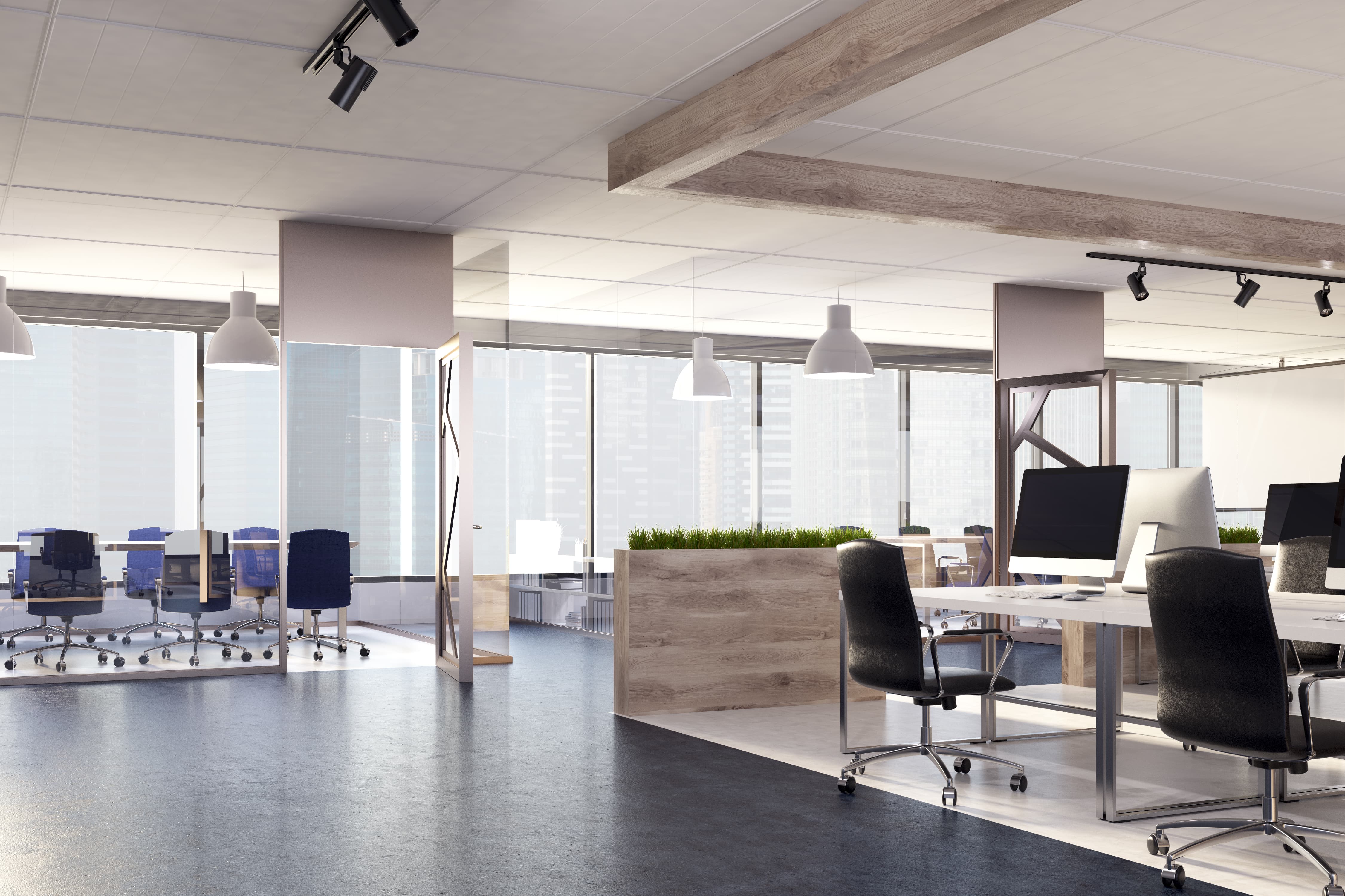
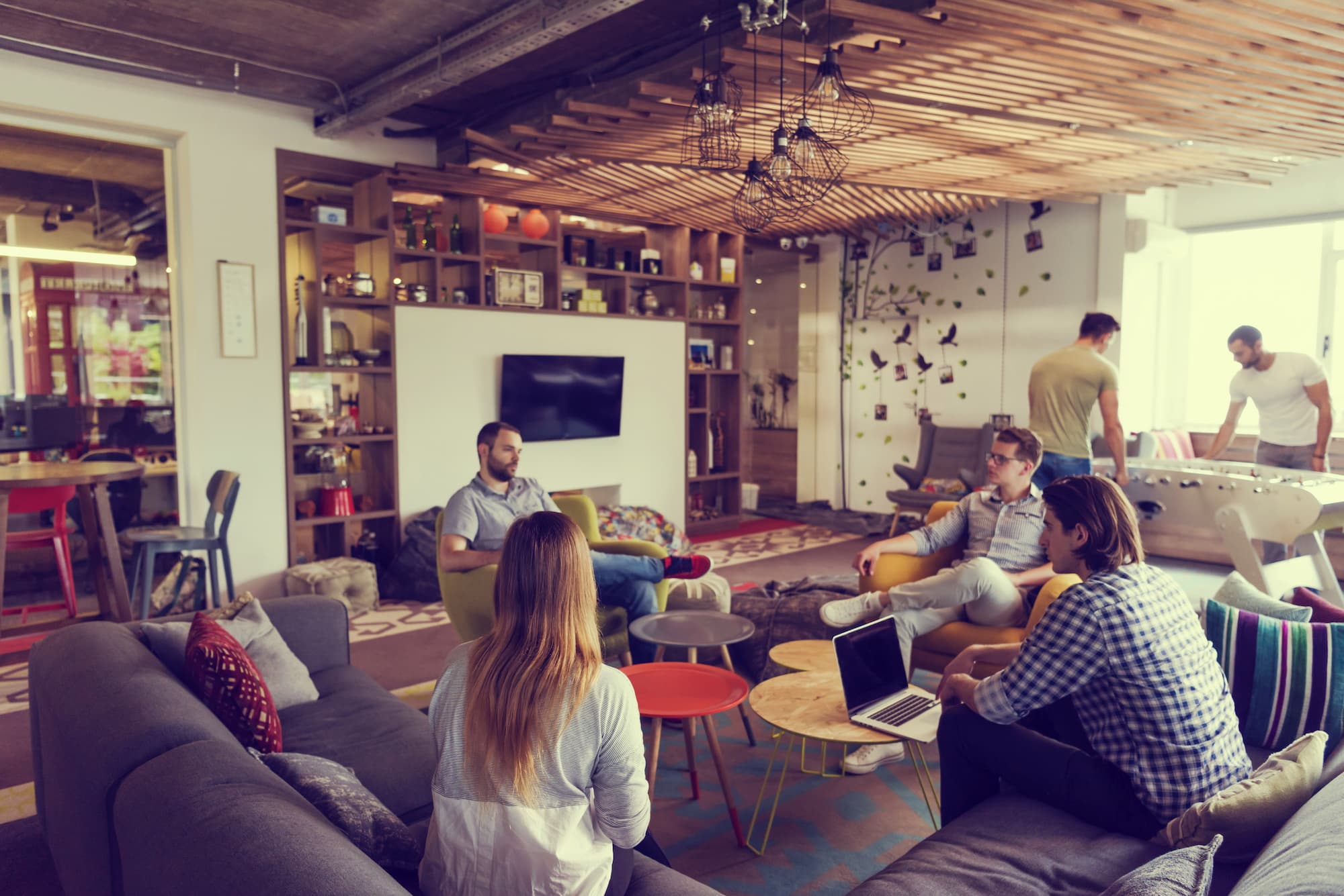
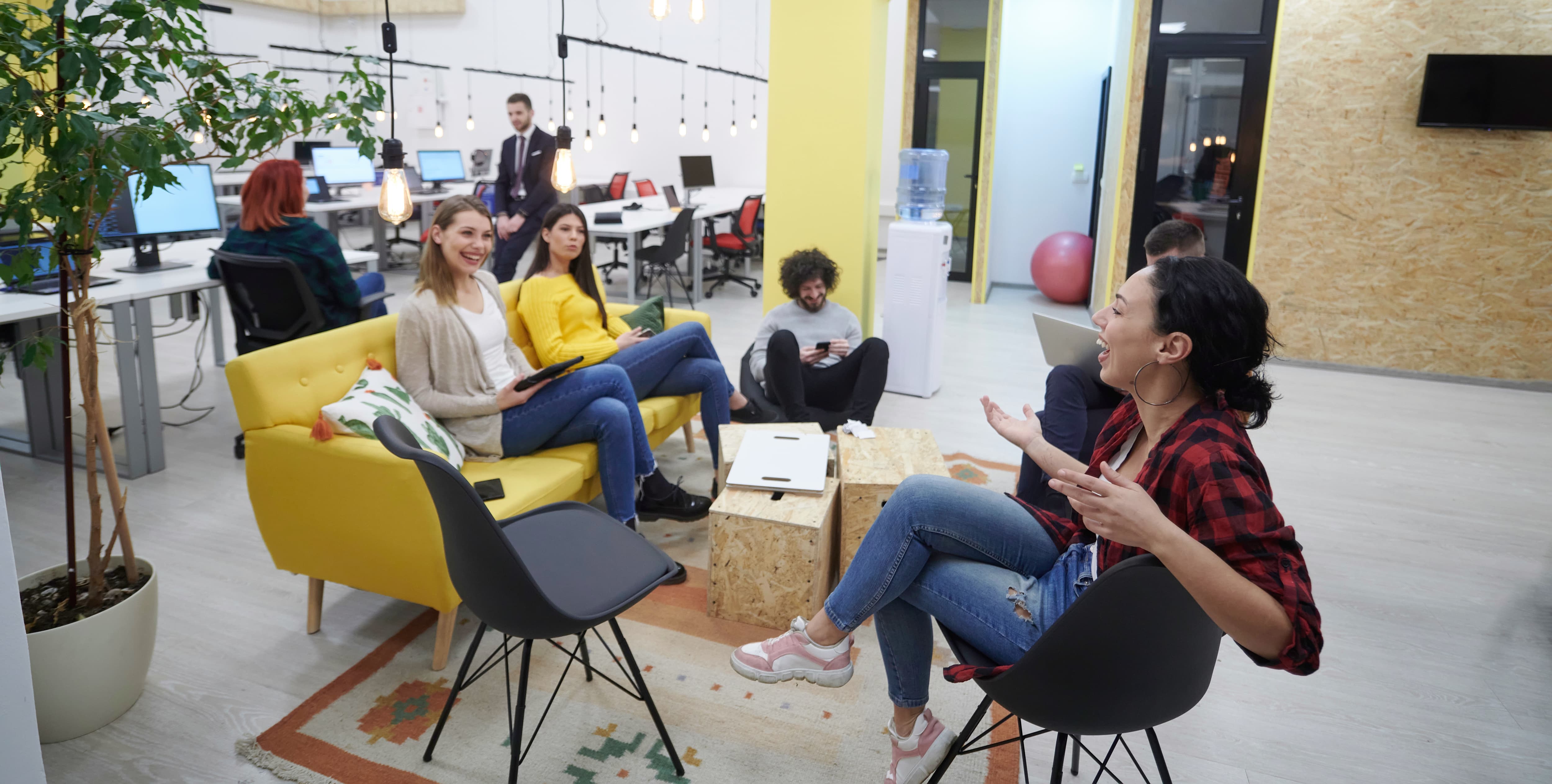
At Truspace, we talk often about the importance of workplace design and how the layout of an office can affect the efficiency but if we go one step further, can the colour have the same impact? Recent research suggests that this is the case and that whilst men feel gloomy in purple and orange surroundings, women can feel sad and even depressed in grey, white and beige. This is vital information for a business and could change many renovation plans.
Furthermore, it isn’t just our mood that is affected by colour, it is also our productivity. Research suggests that the best colours to choose are bright, vibrant shades as they promote happiness, creativity and output. This isn’t necessarily a new theory as the psychology of colours, Chromology, has been studied by business owners for years but it is only now we are starting to see the results of research and various studies.
With this in mind, how can a colour affect a workplace? As mentioned, it can spark creativity and happiness which leads to an increased output but it also has other advantages.
The right colour can trigger certain feelings in customers that will increase the likelihood of making a sale.
In addition to this, if clients enter the office with the right colour, they can subconsciously form a good opinion of the company and its products/services without even seeing or hearing about them.
Let’s breakdown the main colours and what affects they can have on the workplace;
Blue – This often depends on the shade of blue as a dark blue will allow concentration and clear thoughts whilst a light blue will be calming. Blue has been known to slow the heart rate, improve concentration and therefore productivity. Blue has also been linked with a decreased appetite and trust. This is a good option for a workplace although you do have to be careful with the decreased appetite side-effect if your business involves food.
Green – For a long time, green has been linked with growth, fertility and nature and this is no different in the workplace. It often triggers a positive emotion but the shade is an important thing to consider as the wrong option will leave your workers feeling ill. However, a dark shade will promote the feeling of money and wealth.
This is a great option if the general feeling of your business is nervousness; customers will feel calmed and their anxiety will be reduced somewhat.
Red – Red is bright and alarming to an extent, that’s why it is used as the ‘stop’ colour all around the globe. It brings us to attention and can even have physical effects such as an increased heart rate and blood pressure. Red can be good if you need workers to have an increased heart rate and it is also widely used in restaurants as it has been known to increase appetite and therefore sales.
Yellow – This connects with us the most and gives off a general feeling of confidence, happiness, optimism, and more. Again, the shade is vital because one can do all of the previously mentioned and another can trigger anxiety.
Yellow is widely used in a creative field because it inspires workers; however, it wouldn’t necessarily be good for a nursery because children do not react well to solid yellow. It can be a good colour for customers because they will get a general sense of happiness and brightness (it is the colour we use for the sun, after all).


